
Cosy Minimalism
We all need a little darkness.
Friday Jan. 23

On the Market
One featured local listing that stands out from all the rest.
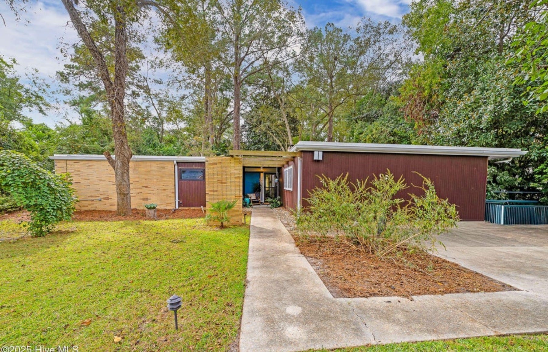
4507 Country Club Road, Trent Woods, NC - Listed for $450,000
Literal mid-century magic in one of my favourite areas: Trent Woods, NC. I love almost everything about this house, except for my one gripe, which is that every. single. room. has been painted white. That said, I always like to remind buyer clients that walls can be painted and floors can be replaced, so look beyond the slightly awkward attempted makeover and envision this beauty in full glory: all natural light, picture windows, parquet floors, original pink 1950s bathroom (with the sink!), and iconic carport intact. She’s a beauty!
You can see more images and read the full listing here.
Room Study: Cosy Minimalism
Once a week I share an image from my private Pinterest board highlighting great design.
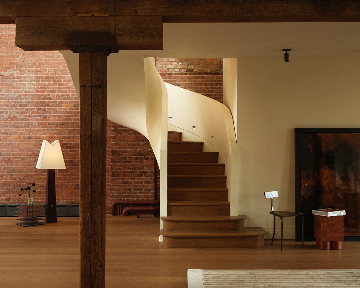
It’s easy to assume that a minimalist interior is also a cold or uninviting one. But if you make this assumption, you’re sorely mistaken. Much like simple doesn’t always equate to boring, minimalism can be much more than white, heartless spaces. The 2024-2025 gut renovation of this Tribeca apartment by Muqaddas Akkari Studio is a great example of how to do this.
Why it works:
→ It has hidden complexity. Texture and pattern are all over this minimalist space: the mortar lines in the brick, the grain in the wood floors and beams, the plaster on the walls and sculptural staircase—in other words, the space is not flat; it has dimension.
→ It uses a lot of warm colour. The plaster is not a sharp, absolute white, it’s softer, like a cream. There’s additional warmth through (you guessed it) wood, and through the brick on the wall, so much so that even if you were to eliminate the items placed throughout, the space feels cozy.
→ It embraces dark and shadow. This is a tricky line to tread. I ascribe very much to biophilic principles of design and the need for natural light, but I also understand the need for dimly lit space. The designers of this space allowed for some shadow and darkness. All bright spaces are stimulating, not relaxing, and some dark space gives the mind and the eye the signal to slow down, calm down and regulate (think of spas).
One Good Thing
If you’re not mathematically gifted, it might frustrate you to know how much numbers make a difference when it comes to good design. While I’m a firm believer that many design rules are made to be broken, guidelines around distance typically exist for good reason.
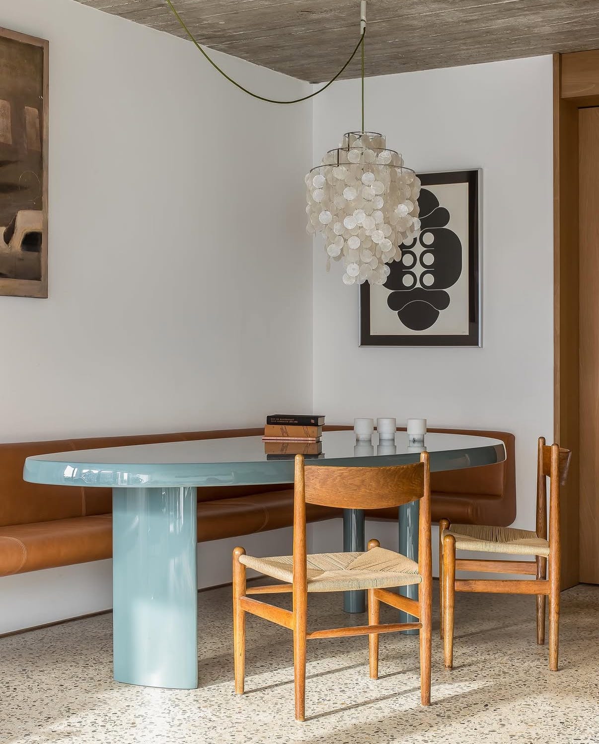
So on that note, here’s a recommendation for hanging a light fixture above a dining table. Aim to hang the light around 30-36 inches from the top of the table (use it as a range, think, 30 for a lower ceiling, 36 for a taller ceiling). This way the light will be close enough to illuminate the table well, but won’t block your view of family members or dinner guests seated at the table.
Pictured: The dining room of Seaside Residence JU by dutch firm AID Architecten, where a chandelier is suspended via swag over the dining table, only partially obscuring the art behind.
Signing off for this week! If you’re looking for more, check out the blog, the podcast, or find us on Instagram and Pinterest.