
Embracing Awkward
I love the challenge of a tough space
Friday Feb. 13
On the Market
One featured local listing that stands out from all the rest.
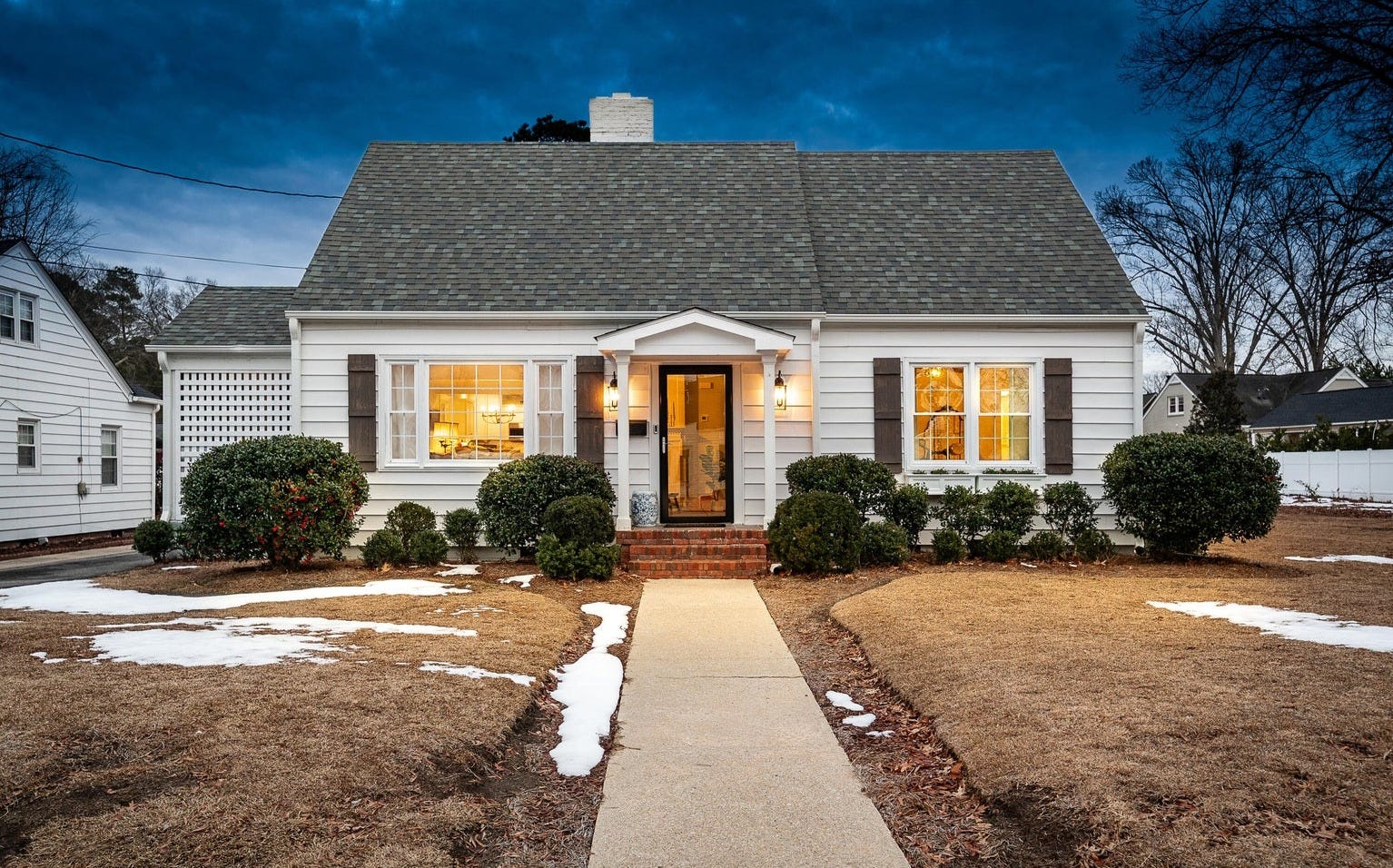
3283 N Contentnea Street, Farmville, NC - Listed for $339,900
The Cape Cod architectural style originated in Cape Cod, Massachusetts, back in the 17th - 18th centuries, and experienced a revival between the 1930s and 1950s, which is around the time this home was built. Like a true Cape Cod home, this 2,100 square foot property features a symmetrical façade, one-and-a-half stories, and a central front door. Inside, the centerpiece of the home is the wide brick fireplace, which welcomes you as you walk in through the front door. The heart of the home, the kitchen, has been modernized with new cabinets and hardware, and has a terracotta-style flooring that imbues the whole space with warmth and character. If you want old home character with modern comfort, this could be just what you’re looking for—all within walking distance to downtown Farmville, NC.
You can see more images and read the full listing here.*
*This is a Haystack Realty Group listing.
Room Study: Embracing Awkward
Once a week I share an image from my private Pinterest board highlighting great design.
When you aren’t able to redo your house from scratch (and oftentimes even when you are), it’s common to end up with spaces that seem to offer more challenges than solutions: double-height walls, awkward ceilings, galley kitchens, narrow “bedrooms”, and rooms so large it’s hard to know where to place the furniture.
Here’s my solitary tip here: embrace the awkward.
Don’t feel the need to camouflage, cover up, or compensate for the challenging space in your home. Lean into it.
We’ve all heard the quote about the round peg in a square hole; don’t let that be true of your space.
Below are three spaces with awkward elements, and here’s how the awkwardness has been leveraged to make them work:
Why they work:
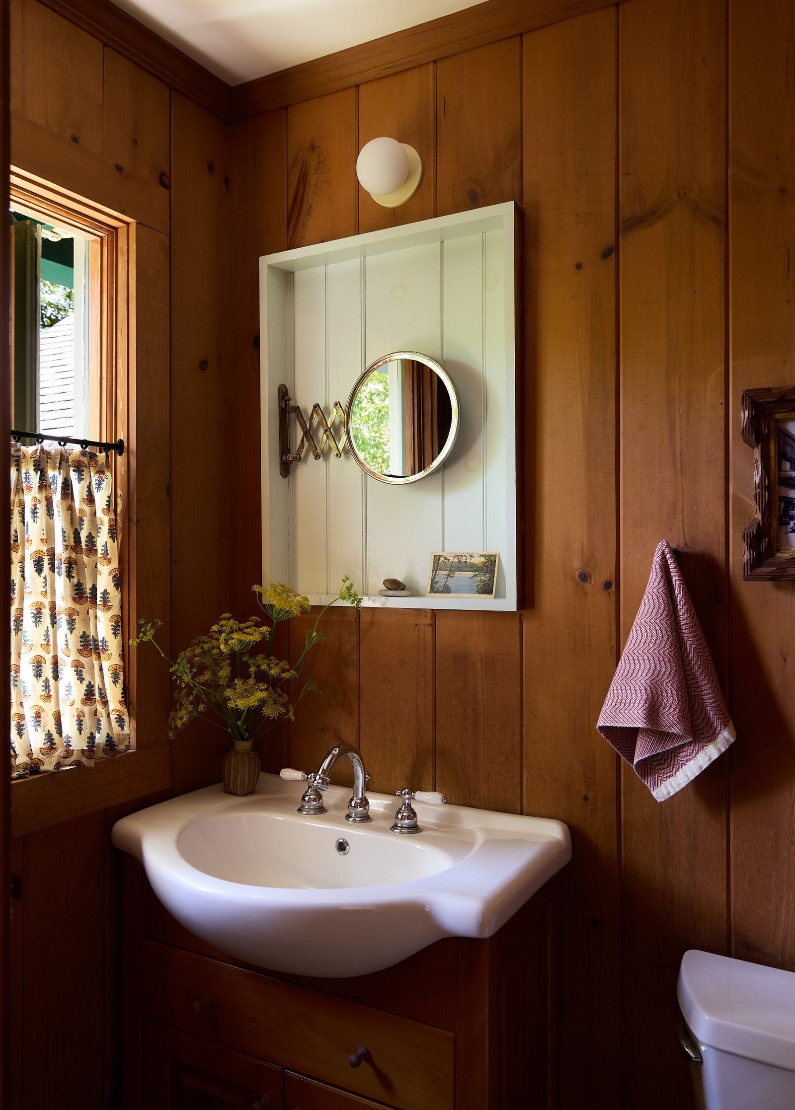
→ The upstate cabin bathroom: This former medicine cabinet space could have been infilled, replaced with another medicine cabinet, or simply covered up with a traditional mirror. I love the choice to put an extendable mounted mirror inside it. We get to see the story of the space and how it evolved, and the result is equal parts charming and unexpected.
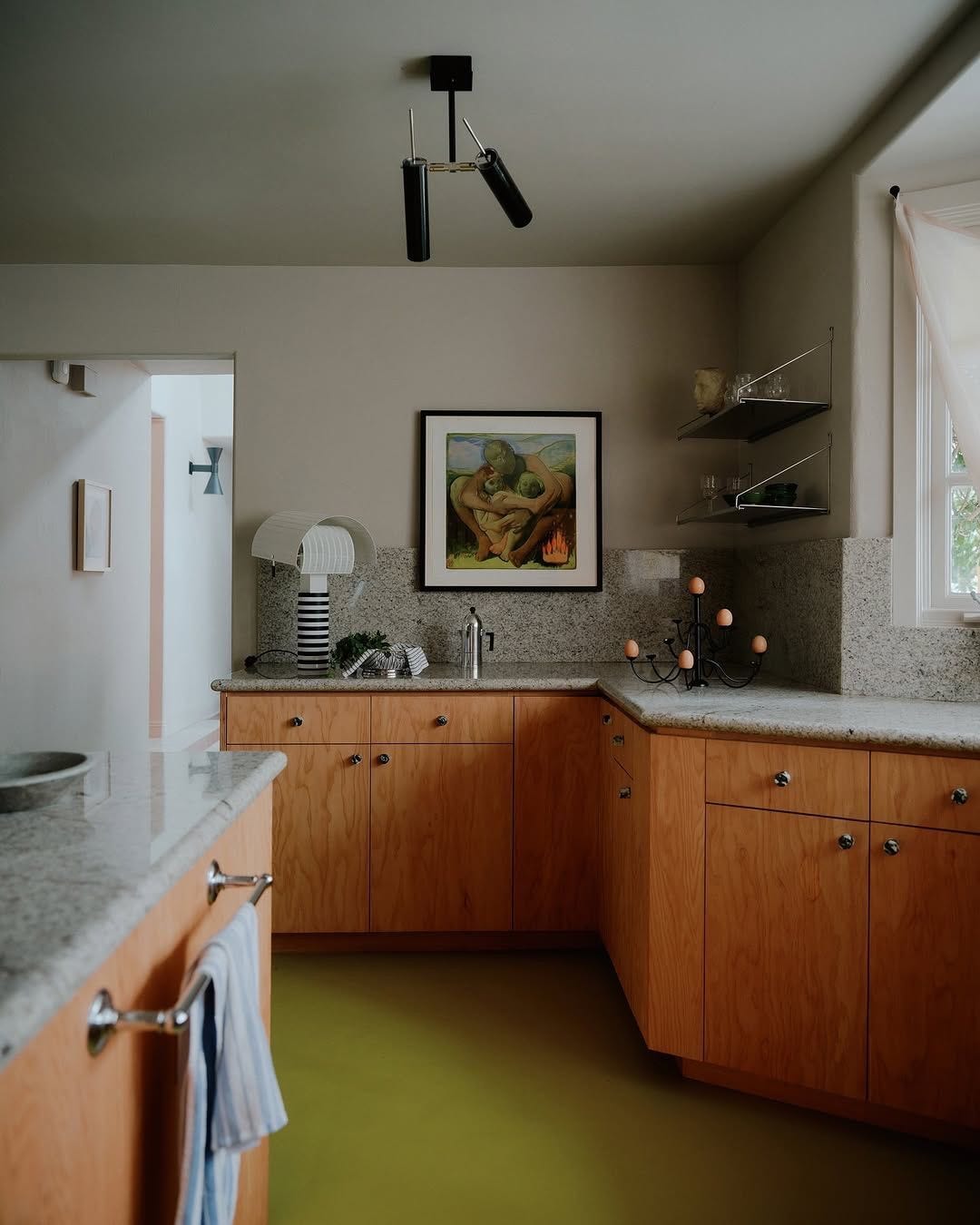
→ The angular kitchen: This wall shape is not desirable. When it comes to countertops and kitchens, two parallel walls and an island (or three perpendicular walls) are the typical preference. The decision to embrace all three walls but calm down visual busyness with open shelving up top gives storage and space without becoming overwhelming.
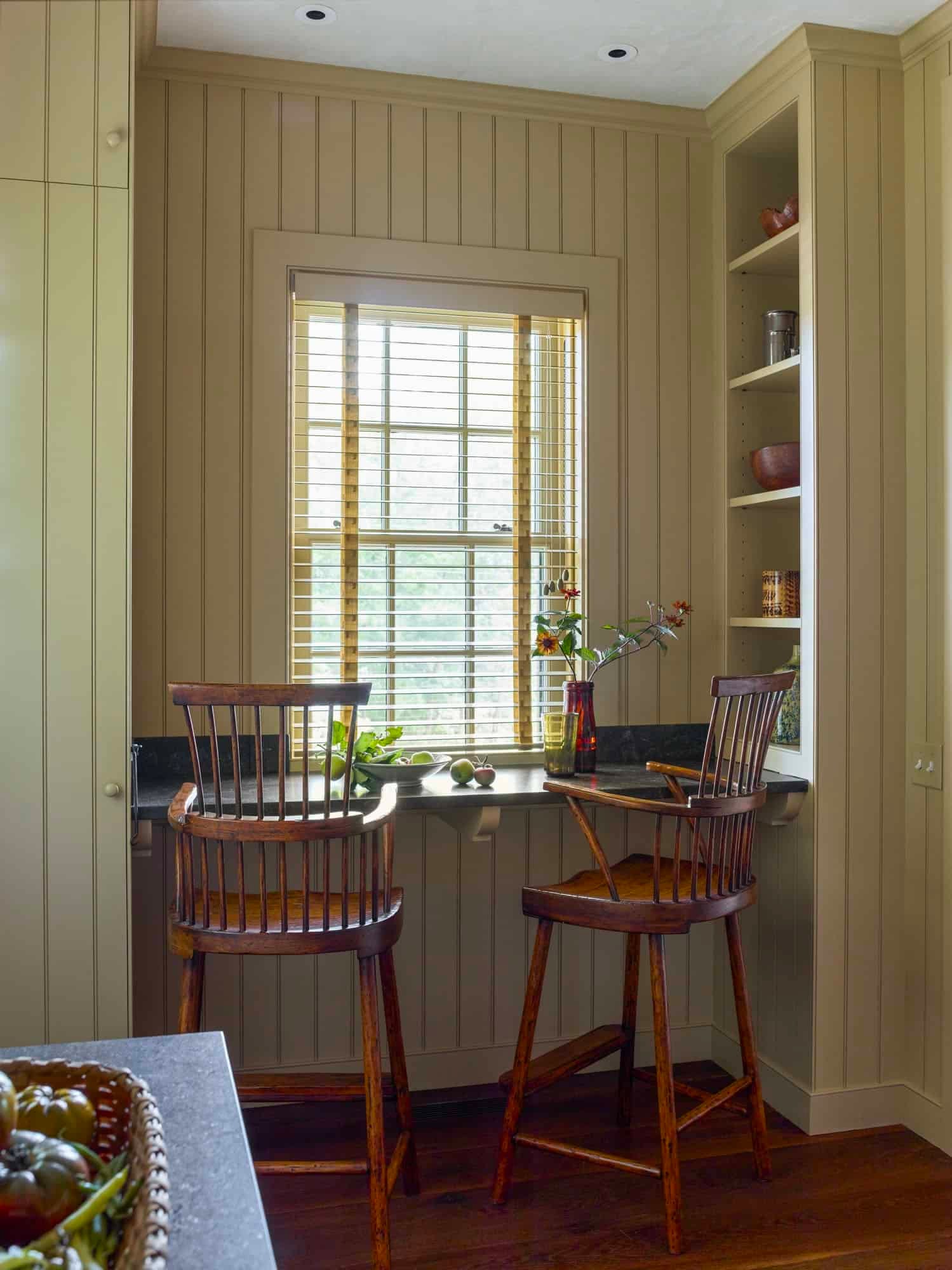
→ The bar height breakfast nook: While a small, table-height banquette nook might have been possible, it would have taken up valuable real estate. Rather than trying to force something larger and weightier into the space, the floating countertop and the leggy nature of the bar height chairs keeps things relaxed and light, and still provides a space to eat.
One Good Thing: Getting Better at Getting Inspired
Where do you go for inspiration?
Exposure is the key to growth. You can’t do better if you don’t know better.
I had a frustrating experience a short while ago when I was looking to book an Airbnb for my family. Many of the properties had the space we needed, but I was overwhelmingly disappointed by the design choices. The thing is, the people putting these spaces together 1) probably don’t care that much about design, and 2) may not know any better.
Design apathy I’m okay with, but a lack of exposure when you do care is a problem.
We need to look beyond the things we’re used to looking at if we want to know and do better. Go to the library and borrow design books (this doesn’t cost you money!). Some libraries may even store past editions of magazines; flip through those (gently). Buy magazines. Go to exhibitions. Read up on designers. Watch videos interviewing architects and master builders and craftsmen and interior designers. Listening to people at the top of their game is one of the easiest forms of self-education. When someone gets a rising star award or ends up on the AD list, go further than liking the post; read up on them. Find out about who designed local buildings you love. The list goes on and on, but if you learn to expand your sources, with very little effort, you’ll begin to hone your nose for good design.
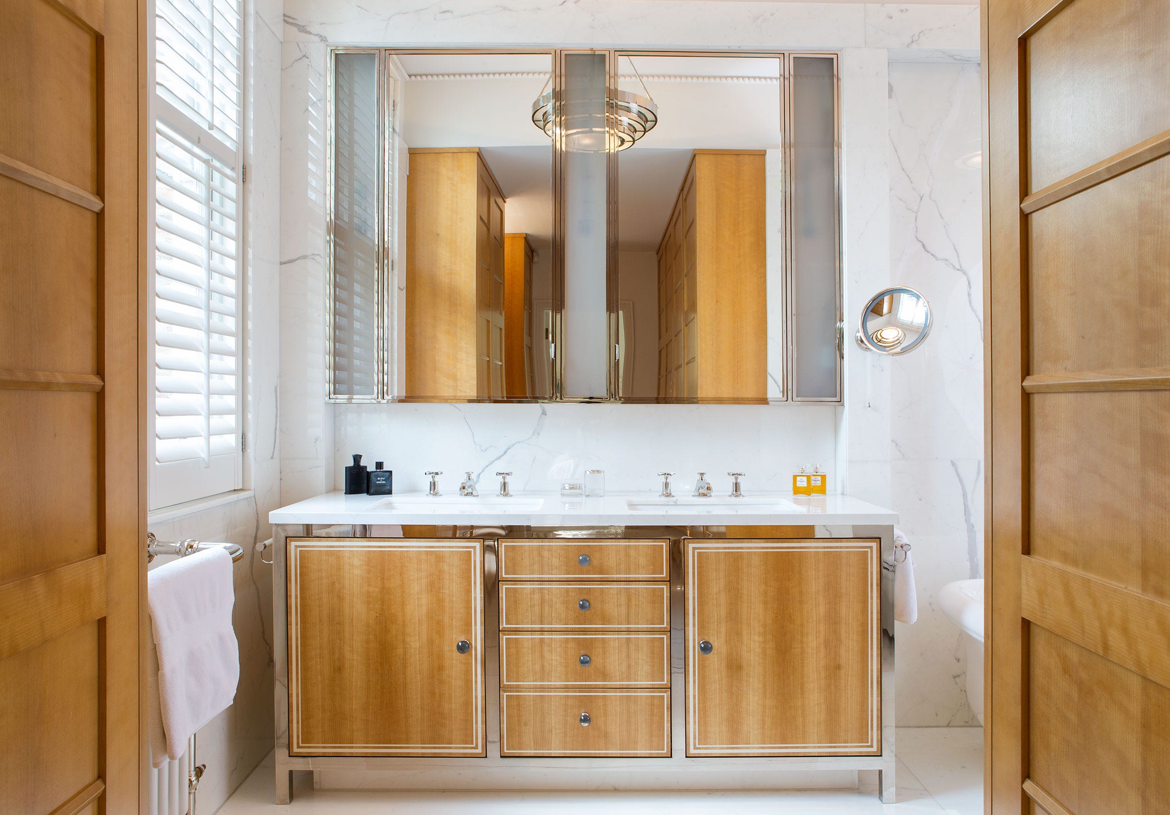
Pictured: The stunning bathroom of a Kensington Town Home by interior designer Hugh Leslie. The space feels very light and bright, partially due to the window, but largely due to the choice of materials: polished metal on the base of the vanity and the frames of the mirrors, reflective marble on the walls, and even the knobs on the vanity, which appear to be marble or some other stone.
Signing off for this week! If you’re looking for more, check out the blog, the podcast, or find us on Instagram and Pinterest. Make sure you’re subscribed to get updates on the renovation!