
How to include pattern when you’re pattern-averse
Hint: It's all about "going small"
Friday Nov. 21
On the Market
Three Listings Worth Seeing
116 W Gale Street - a charming 1940s brick Tudor revival complete with charming latticed windows, a Tudor-style plank door with windows, and a steeply-pitched front gable roof. Inside, the charm continues with a respectfully updated kitchen and bathrooms, and a second floor landing area with beautiful pine ceilings.
103 S Moseley Street - a 2,000 sq ft. 1920s cottage with soaring ceilings, original interior doors and millwork, and hardwood flooring throughout. Favourite features include: all the fireplaces, the striking red (I know!) front entry hall, and the staircase going up to the second floor.
203 N Granville Street - a foursquare inspired brick home with spacious reception rooms, large windows, and a unique, pine-paneled primary bedroom suite. Upstairs, connecting bedrooms offer flexibility and function, and original millwork details infuse character and a sense of style.
Room Study: Expensive spaces don’t always look expensive.
Once a week I share an image from my private Pinterest board highlighting great design.
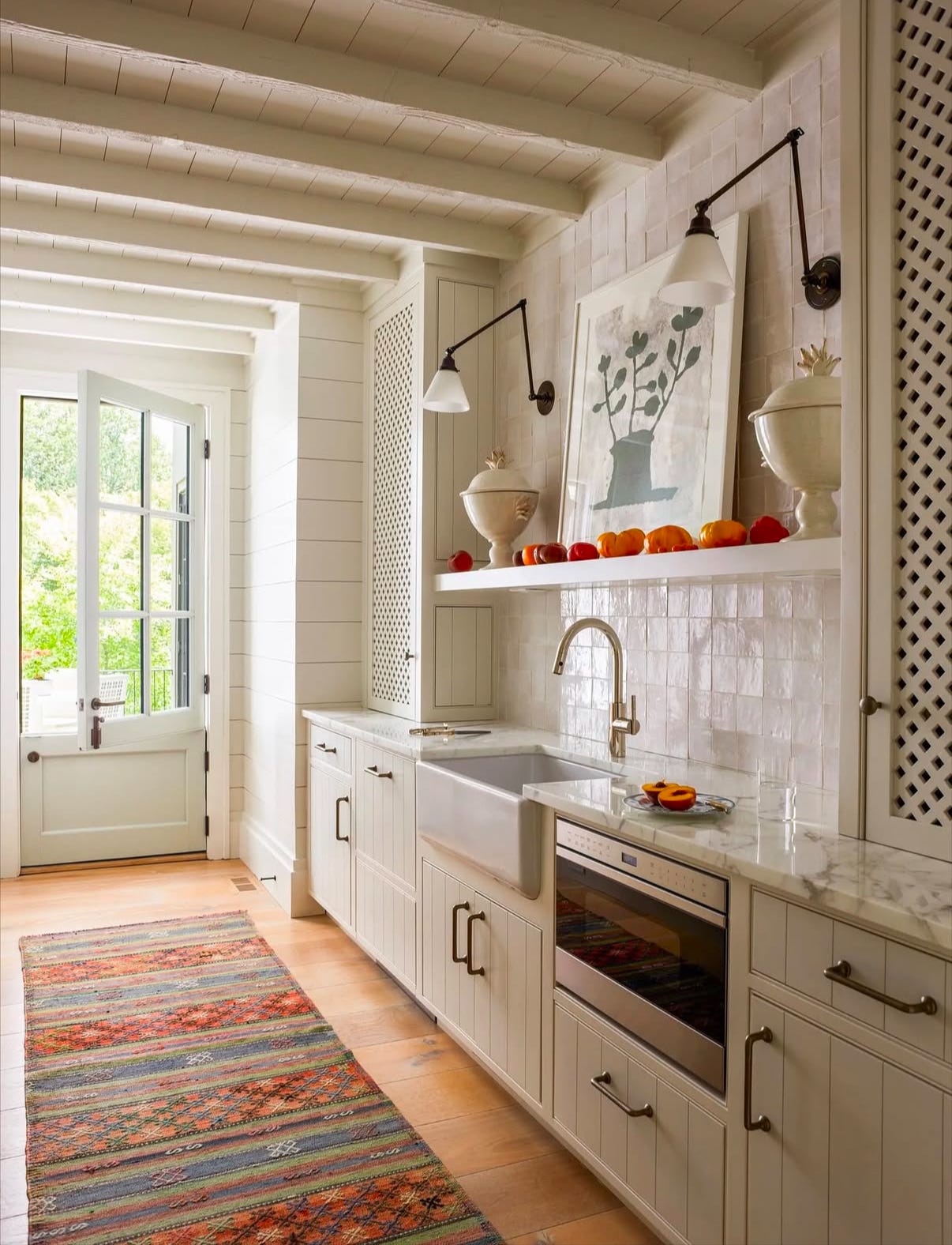
This scullery was not cheap to make, yet it doesn’t feel flashy, ostentatious, or gaudy. It feels like a casual space. Here’s where the money is hiding:
→ It’s in the material choices. Zellige tiles, wide-plank wooden floors, oil-rubbed bronze and polished nickel fixtures and hardware, and quartzite countertops shape the relaxed, refined feel of the space.
→ It’s in the prioritization of function. Look at the large, deep, apron-front sink, the microwave drawer under the counter, and the clever storage tucked into the sides of the lattice-front cabinets. This is a space designed to be used as well as seen.
→ It’s in the deliberate design choices. There are clear design choices made largely for aesthetic reasons: the aforementioned lattice-front cabinets, the inset cabinet style, the dutch door, even the shiplapped walls and ceiling. Adopting these design styles requires careful craftsmanship, and good craftsmanship doesn’t come cheap.
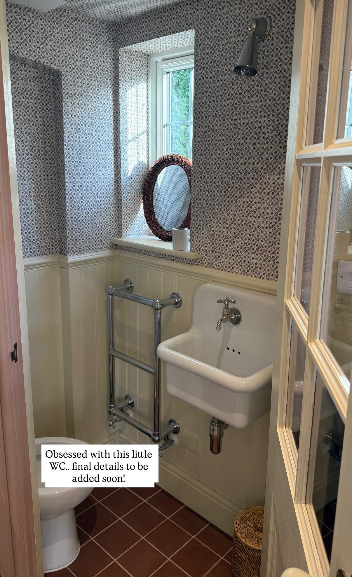
One Good Thing: How to include pattern when you’re pattern-averse
This is a quick one, but a good one. Here it is: Use a micro-pattern.
Micro-patterns used to cover large areas act like neutrals. Pick a neutral colour from within the pattern to use alongside, and if you’re feeling brave, pull a less neutral colour and use it, elsewhere, like on the floor or on the ceiling.
Pictured: A sweet little in-progress powder bath by Vaughan Design and Development, where the red from the micro-pattern wallpaper is echoed on the tile floor, and the creamy beadboard colour is also pulled from the wallpaper.
Signing off for this week! If you’re looking for more, check out the blog, the podcast, or find us on Instagram and Pinterest.