
Leveraging Visual Weight
Symmetry is overrated
Friday Jan 30

On the Market
One featured local listing that stands out from all the rest.
4225 E Church Street, Farmville, NC - Listed for $339,000
This 100-year old bungalow is just over 3000 square feet, and has some quintessential Arts and Crafts movement style: a symmetrical brick facade, with a full width front porch topped with a full size dormer. Inside, there are several fireplaces, a simple open floorplan, wood floors, and solid, original (I think) wooden doors. My favourite features and spaces include: the staircase, the sunroom, and I think, with a little love, the kitchen.
You can see more images and read the full listing here.
Room Study: Bathrooms You Could Hang Out In
Once a week I share an image from my private Pinterest board highlighting great design.
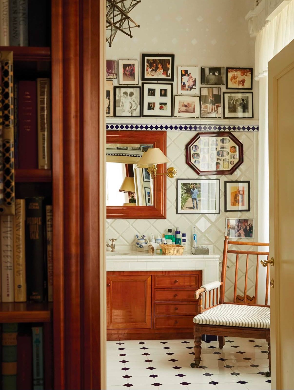
Why it works:
→ It leverages furniture over fixtures. There is a clear commonality amongst all the rooms in your house (outside of your bathrooms and possibly your kitchen), and it’s that they all contain real furniture. They have real tables, real chairs, real light fixtures and decor; they don’t just have equipment or appliances. Bathrooms that invite staying are much the same: they have chairs and tables, plants, and real window dressings (not just a window with privacy glass or slatted blinds). Include real furniture and decor to make your bathroom feel finished and cosy.
→ It’s personal. One of the first things I noticed about this photograph after I realized I loved it, was the presence of all the renowned designer’s personal items. There are obviously the photographs all over the walls, but in addition to all that, his health and skincare essentials are front and center on the countertop. The presence of photographs promotes lingering, because it invites an additional activity after all the bathing is done. And the fact that his skincare essentials are not hidden away also says, “this is a space for me”. Your bathroom is for you. It’s not supposed to impress anyone else. Make it something that works for you.
→ It’s unfussy. There’s warmth and character, and while it is refined, it’s also relaxed: no perfect symmetry, photos askew, mixed metals. It doesn’t look like an image from a Pottery Barn catalogue, where everything is perfect, instead it’s patinated, full of character, and full of charm: the kind of place that invites you to sit down, take your shoes off, and wash off the cares of the day.
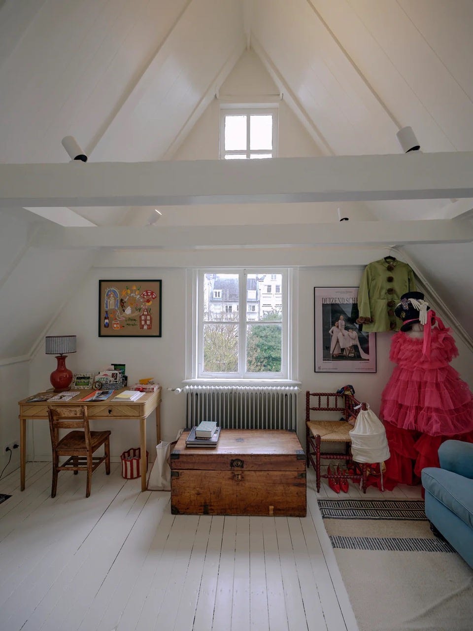
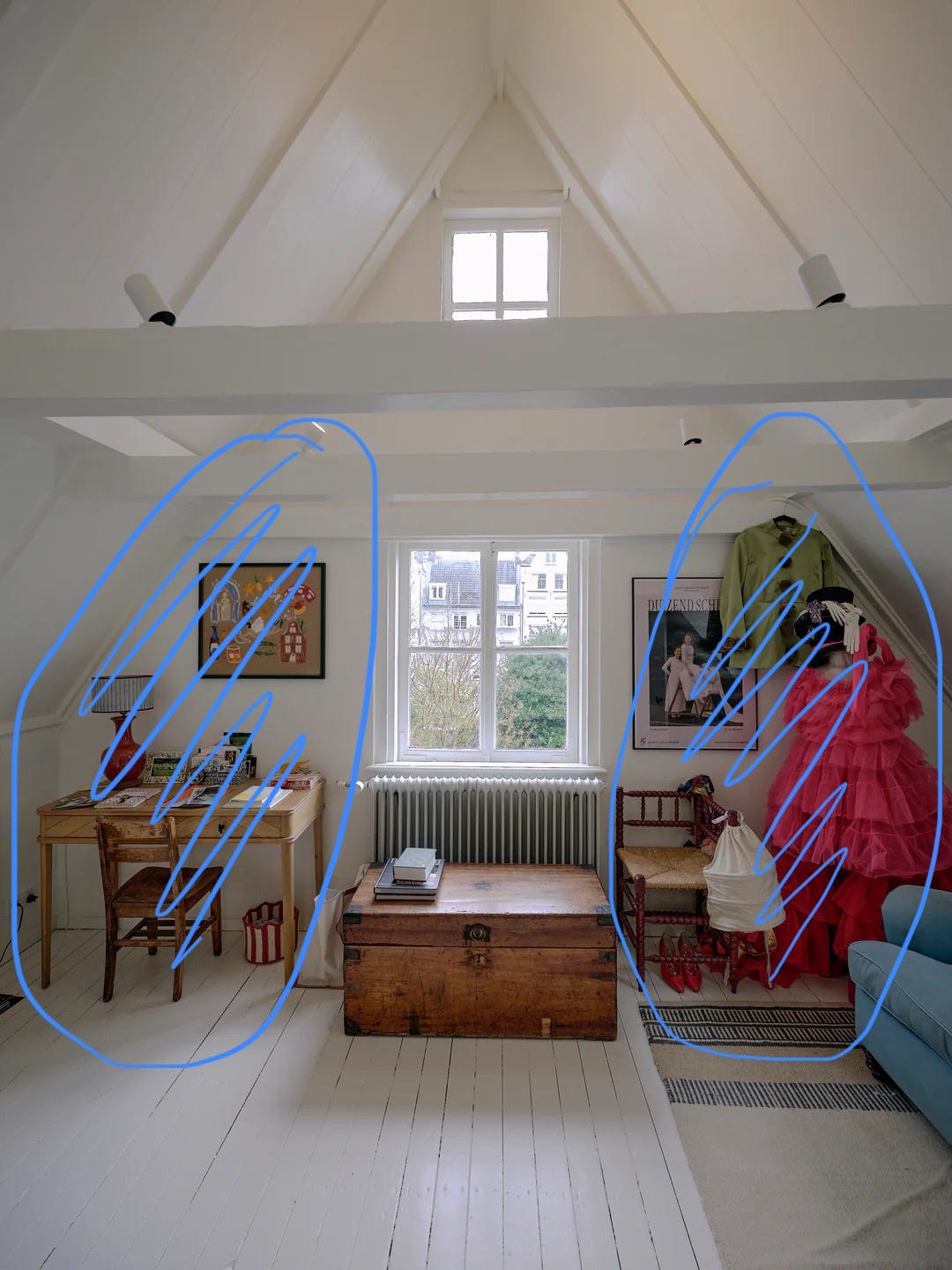
One Good Thing: Equal Weight > Symmetry
I think very often in design (on tv, mostly), we are shown symmetrical design. You’ll see a king-sized bed with identical nightstands, lights, and art, or a sofa opposite an identical sofa.
While I understand the appeal for twinning, you don’t need symmetry for good design. Instead of visual symmetry, I recommend going for roughly equal visual weight.
In the image below, while the two sides don’t mirror each other exactly, around the same amount of visual space is being occupied by both (there’s an annotated version below it to help you see it).
You also — wait for it — don’t need to have any kind of equality at all. The key is that when you’re doing this you have to be intentional about where you’re using visual weight and where you’re using empty space. If it isn’t purposeful, it’s going to feel and look very much like an afterthought, so approach this with caution (maybe we can cover intentional empty space in next week’s newsletter).
Pictured: Louise Snouck Hurgronje’s 17th Century Canal House, where the visual weight of the desk and art on the left are roughly equal to the visual weight of the dresses, art, and chair on the right.
Signing off for this week! If you’re looking for more, check out the blog, the podcast, or find us on Instagram and Pinterest.