
Punctuation in Design
+ living large in small spaces
Friday Mar. 27
On the Market
One featured local listing that stands out from all the rest.
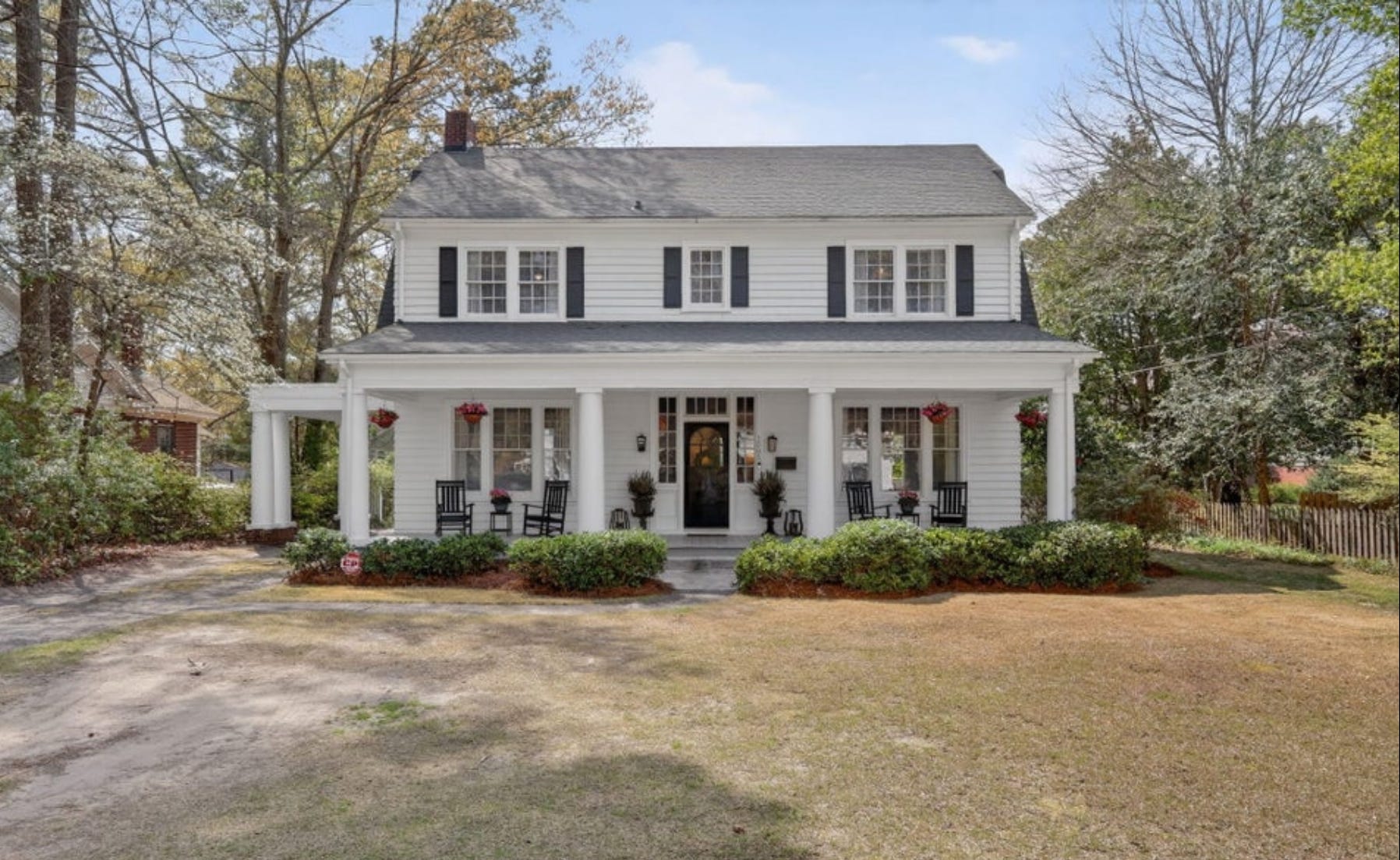
1505 Nash Street N, Wilson, NC - Listed for $335,000
This 2000-square foot 1920s colonial revival home features Tuscan-style columns, a full-width front porch, and an abundance of charming details, including: custom built-ins, louvered cafe shutters, original solid wood doors, beadboard paneling, and well-placed beams. Gently and thoughtfully updated, the home features 3 bedrooms, two full bathrooms, and multiple fireplaces.
You can see more images and read the full listing here.
Design Study: Punctuation


I wrote about contrast a few months back; how we need it to make things interesting. I had noticed how there was a lot of design that I thought was not unappealing in nature, but was somewhat flat, even if it was warm and inviting, and I realized lack of contrast was to blame.
Let’s turn to nature for a minute: what are colours are commonly found in nature? Greens, browns, and blues are likely the ones that come to mind first. But there are also yellows, reds, lilacs, oranges, plums, whites, etc. These more vibrant, more saturated colours often punctuate the more dominant, more subdued ones, and the result is beauty. It’s why fields of poppies and rows of tulips delight us so much more than a plain old field of grass.
Pops of colour bring brightness and joy, as well as contrast.
If muted, subdued colours feel safest to you, punctuate your low contrast spaces with vibrant colours. For example: a mirror with a red frame, a yellow clock, or, on an even lesser scary scale, a vase full of colourful flowers, a bowl full of fruit, or a book with a brightly coloured spine.
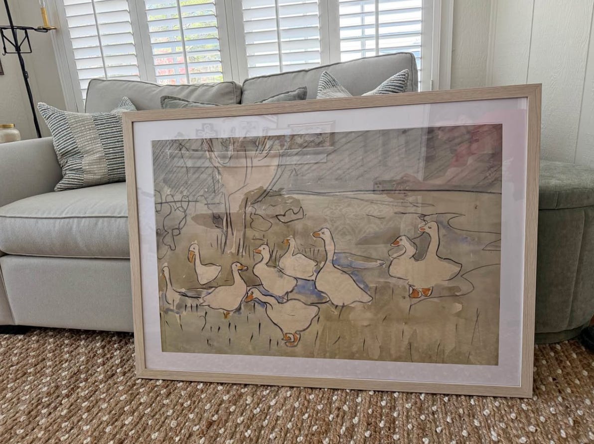
More examples are shown above.
Watch this: Unlocking the Mysteries of Place with Gil Schafer
If you’ve been a newsletter subscriber or podcast listener for some time, you know I’m a big fan of architect Gil Schafer. His knowledge, humility, and incredible attention to detail make him an absolutely fascinating person to listen to and learn from. Frederic Magazine is doing a documentary series on his work, and you can watch it here.
Warning: If you’re at all sentimental like I am, the combination of the music, wisdom, and visuals may make you cry.
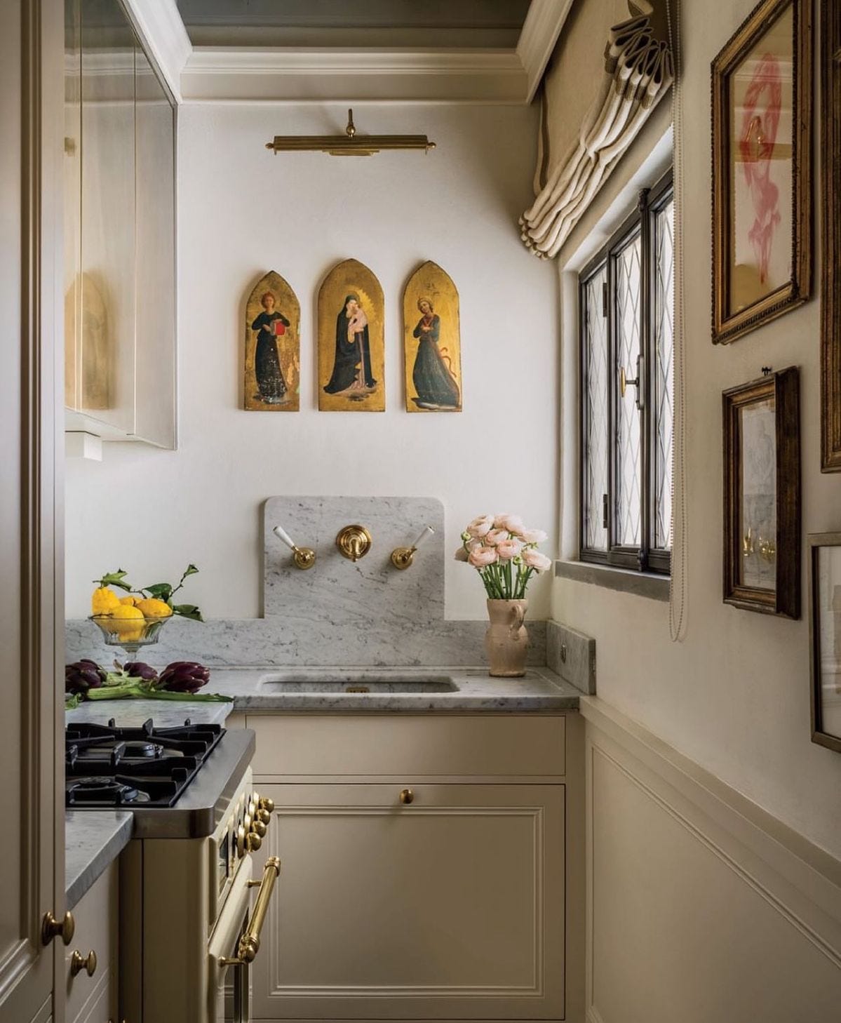
One Good Thing: “Giving” space when the room is small
Just because a room is small doesn’t mean it has to feel cramped. You can enjoy the feeling of spacious living even with a small footprint. A few quick tips on how to do so:
Clear the floor → The more space the eye can see, the bigger the room feels
Go for neat open shelving or curio cabinetry → Open shelving gives depth that closed cabinetry doesn’t. Depth gives the eye more to look at, aka illusion of more space. Mirrors provide depth too, btw.
Draw the eye up → Use striped wall and window treatments, tall plants, pedestals, and strategically placed light-fixtures to give the illusion of great ceiling height. Tall ceiling = more space.
Pictured: A stunning tiny Italian kitchen by Huff Harrington, where the mirrored cabinetry and largely empty walls make the small space feel luxurious rather than claustraphobic.
Signing off for this week! If you’re looking for more, check out the blog, the podcast, or find us on Instagram and Pinterest.